


How Data Storytelling Became My Secret Weapon at Work

I never expected data storytelling to become my secret weapon at work. At first, I relied on charts and spreadsheets, but something was missing. Then I noticed a shift: stories, not just numbers, made people lean in and take action. Gartner predicts that by 2025, most analytics will be consumed through stories, not dashboards. The numbers prove it—data storytelling now drives real engagement across platforms.

This powerful tool transformed how I deliver insights and connect with my audience.
Key Takeaways
Data storytelling turns complex numbers into clear, memorable stories that engage and inspire action.
Understanding your audience helps tailor stories that connect emotionally and build trust.
A strong story has a clear message, real examples, and a simple structure to keep people interested.
Combining visuals with stories makes data easier to understand and remember.
Effective data storytelling leads to better decisions, faster actions, and measurable business results.
The Turning Point
Facing Resistance
I remember one project that changed everything for me. I had spent weeks building a complex data analytics dashboard for our sales team. I walked into the meeting, confident that my charts and numbers would win everyone over. Instead, I watched as people glanced at their phones, zoned out, or even questioned my calculations. My logic and data alone failed to spark any real interest or action.
Human attention spans are short—about 15 to 20 minutes. Distractions like emails and notifications make it even harder to keep people engaged. I realized I was overwhelming my audience with too much information, like showing every oyster instead of just the pearl.
Here’s what I noticed:
Walking through every step of my analysis bored the team.
People wanted the shortest, simplest path to the answer, not a deep dive into every detail.
My audience needed context, not just raw data.
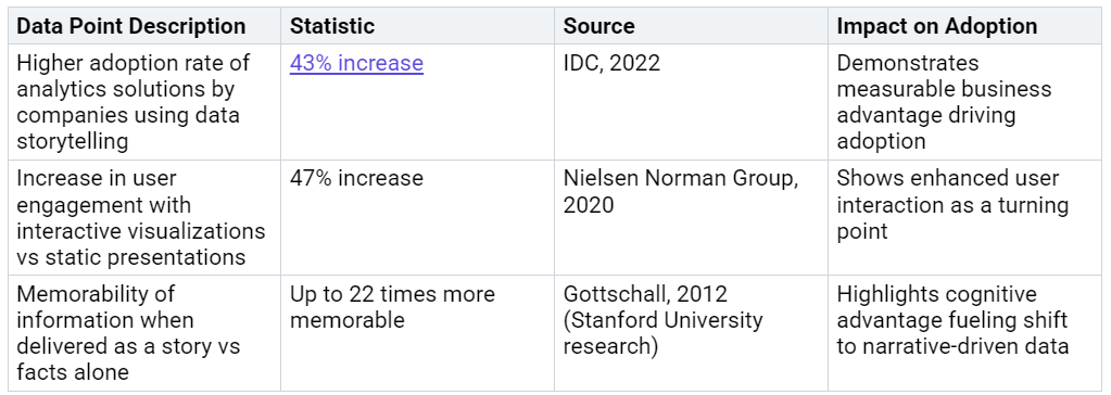
The numbers back this up. Take a look at these turning points in adopting data storytelling:
The Power of Story
That meeting forced me to rethink my approach. I started to see that people resist new ideas when they feel threatened or disconnected. Neuroscience research shows that stories activate many parts of the brain, not just those for language. Stories trigger emotions, create vivid mental images, and help people relate to the message. This emotional connection makes stories more memorable and persuasive.
Brent Dykes, a data storytelling expert, explains that audiences often hold onto old beliefs. A compelling story can replace those beliefs and open minds. As Shawn Callahan says, “You can’t beat a good story with a fact; you can only beat it with a better story.” I learned that if I wanted to inspire action, I needed to craft stories that made my audience feel the impact of the data.
When I paired data with a real story—like sharing how a sales rep used insights to close a big deal—people leaned in. They remembered the message. They took action. Data storytelling became my secret weapon, turning resistance into engagement and driving real results.
Why Data Storytelling Works
Science Behind Engagement
I used to think that a great data visualization could speak for itself. I believed that if I designed the perfect chart, people would instantly understand my insights. I was wrong. The real breakthrough came when I learned how our brains process information. Neuroscience shows that when we hear a story, our brains light up in ways that raw data alone cannot achieve. Multiple fMRI studies reveal that narrative activates the default mode network, especially the medial prefrontal cortex. This part of the brain helps us evaluate characters, process intentions, and connect emotionally. Regions like the inferior frontal gyrus and anterior cingulate cortex synchronize when we relate to a character, making us more engaged.
When I combine data visualization with storytelling, I see people remember my message much longer. According to a Deloitte study, message retention increases by 22 times compared to standard data presentations. That is a massive difference in engagement.
I noticed that when I use visual design to highlight a meaningful narrative, my audience pays closer attention. Dopaminergic reward pathways in the brain make storytelling pleasurable, so people want to listen and remember. Visual design is not just about making things look good; it is about guiding the audience through a journey that sticks.
Emotional Connection
Emotions are the secret ingredient in data storytelling. When I add emotional context to my visualizations, I see stronger connections form between my audience and the data. Brent Dykes points out that blending data, narrative, and visuals creates emotional resonance. This approach makes my insights more credible and actionable.
Quantitative research supports this. When I spot a trend in the numbers, I dig deeper to find the emotional "why" behind it. I use visual design to weave together qualitative stories and quantitative data. This combination helps my team understand not just what is happening, but why it matters.
A recent statistical study found that narrative visualizations with emotional anecdotes increase understanding and trust. People feel more concern and take action when they see the human side of the data. By focusing on emotional resonance, I make my visualizations more persuasive and memorable. This is how I turn insights into real impact.
Making Data Storytelling Your Secret Weapon
Know Your Audience
Understanding your audience is the first step to effective data storytelling. I learned that when I tailor my message to the people in the room, my insights land with more impact. Audience segmentation transforms generic presentations into targeted conversations. For example, I once analyzed a marketing campaign that had high clicks but low conversions among women aged 25 to 34. By digging into the data, I realized this group cared more about sustainability than cost savings. I adjusted my message, and engagement soared.
Tip: Collect audience data through surveys, interviews, or analytics. Build personas that reflect their values, interests, and pain points. This approach simplifies complex ideas and ensures your message resonates.
Segment your audience by demographics, interests, and behaviors.
Use focus groups or feedback sessions to test your narrative.
Develop detailed personas to guide your visual design and storytelling.
When I focus on understanding your audience, I can craft stories that feel personal and relevant. This builds trust and credibility, making my data visualization efforts far more effective.
Craft the Story
Crafting the story is where data comes alive. I used to overwhelm people with dashboards and technical jargon. Now, I start with a clear core message and structure my findings into a beginning, middle, and end. This narrative approach keeps people engaged and helps them remember what matters.
Present key patterns using effective data visualization and visual design.
Conclude with actionable recommendations.
I always include relatable characters or real-life examples. For instance, when I shared how a sales rep used insights to close a deal, the team paid attention. Visual design supports my story by clarifying complex data and guiding the audience through the journey.

A well-structured narrative, supported by visualization and visual design, inspires action and makes insights stick. When I tell a story, I connect data to real people and real outcomes. This approach builds trust and credibility, and it inspires teams to act.
Inspire Action
The ultimate goal of data storytelling is to inspire action. I have seen firsthand how a compelling call to action, framed with ownership or social proof, drives measurable change. For example, a VP of Sales used a storytelling framework to address inconsistent performance. By embedding measurable results in the story, the team achieved a 35% revenue increase and a 30% reduction in sales cycle times.
Note: Calls to action that use social identity, commitment language, or loss aversion can boost engagement by up to 22% or more, according to behavioral science research.
Use ownership language (“This insight is for you”) to trigger commitment.
Frame messages around community impact to increase buy-in.
Highlight real-world results to show that your recommendation works.
Storytelling activates multiple areas of the brain, making your message more memorable and persuasive. When I use visual design to reinforce my call to action, I see higher engagement and faster decision-making. Organizations that prioritize effective data visualization and narrative see up to a 40% improvement in decision-making speed and a 70% boost in employee engagement.
Data storytelling is not just about sharing numbers. It is about understanding your audience, crafting the story, and inspiring action. This approach builds trust, simplifies complex ideas, and drives real results. When I use these steps, I turn data into my secret weapon for influence and impact.
Practical Wins
Real-World Example
Let me share a story that truly changed how I approach data visualization and insights. I worked with a mid-sized retail company struggling with high cart abandonment rates. My team and I decided to move beyond static dashboards. We built a visualization that mapped the customer journey, highlighting pain points with clear, simple graphics. We paired this with a narrative that followed a real customer’s experience from browsing to checkout.
The results spoke for themselves:
Customer service response time improved by 50%.
Customer satisfaction scores jumped from 3.5 to 4.8 in just three months.
A client testimonial summed it up: “We finally understand what our customers feel and where we can help them. The new approach differentiates your brand and makes every decision easier.” This experience proved that effective visualization and storytelling can drive measurable change.
I have seen similar wins in other industries. Dropbox used data-driven marketing and visualization to boost open rates by 18% and click-through rates by 25%, leading to a 10% increase in online sales.
Lessons Learned
What did I learn from these experiences? First, visualization is not just about making data look good. It is about making insights clear and actionable. When I combine data analytics with a strong narrative, I see faster decisions and better results.
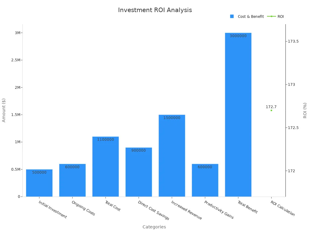
Here is a table that shows the ROI from one of our projects:
Tip: Use visualization to tell a story that connects with your audience. Focus on the people behind the numbers. This approach inspires action and builds trust.
If you want to drive change, start with a clear story, use visualization to highlight key insights, and always keep your audience in mind.
Data storytelling changed how I work. I saw measurable impact figures turn complex data into clear, trusted stories. These stories built credibility and helped my team make better decisions. When I focus on emotional connection, simplicity, and relevance, I see real results. I encourage you to experiment with storytelling in your next data project. Let inspiration guide you. I want every user feel inspired to share their own story and take the first step toward making data matter.
FAQ
How do I start using data storytelling if I am not a natural storyteller?
I focus on real examples from my work. I pick one person or situation. I describe what changed because of the data. I keep it simple. Practice helps me improve.
What tools help me create better data stories?
I use PowerPoint, Tableau, or Canva for visuals. I sketch my story first. I choose clear charts and add short, strong captions. I always test my story with a colleague.
How do I handle skeptical audiences?
I share a quick, relatable story. I show how the data affects their daily work. I ask questions to involve them. I use facts and emotions together. This approach builds trust.
Can data storytelling work for technical teams?
Absolutely! I use stories to explain complex results. I highlight how the data solves real problems. I keep jargon to a minimum. My technical peers appreciate clear, focused stories.
What is the biggest mistake to avoid in data storytelling?
I avoid overwhelming my audience with too much data. I focus on one clear message. I always connect the data to people and real outcomes. Simplicity wins every time.