


Matplotlib vs Seaborn A Comprehensive Comparison for Data Scientists

When working with data in Python, you need reliable data visualization tools to transform raw numbers into meaningful insights. Two popular options in the Matplotlib vs. Seaborn debate are Matplotlib and Seaborn. Both libraries help you create graphs that make complex data easier to understand. Matplotlib offers unmatched flexibility, while Seaborn simplifies statistical visualization with its user-friendly interface. Choosing between Matplotlib vs. Seaborn often depends on your expertise and the type of visualization you want to create. Understanding the strengths of each tool will help you select the one that best fits your needs.
Key Takeaways
Matplotlib is very flexible and can make many types of charts. It is great for advanced users.
Seaborn makes it easy to create nice-looking graphs with little effort. It is perfect for beginners.
Using both Matplotlib and Seaborn together can help you make better charts by using the best parts of each.
Matplotlib works faster with big datasets because of how it is built. Seaborn might be slower with large data.
Start with Seaborn for quick and simple graphs. Then, try Matplotlib for more detailed and custom charts.
Matplotlib: The Foundation of Python Visualization
Key Features of Matplotlib
Matplotlib has been a cornerstone of Python visualization since its inception in the early 2000s. It allows you to create a wide variety of plots, including bar charts, scatter plots, histograms, and even 3D visualizations. As an open-source library, it is widely used for producing static, animated, and interactive graphs. One of its standout features is the object-oriented API, which lets you embed plots into applications using different GUI toolkits. This flexibility makes it a go-to tool for developers and data scientists alike.
Another key feature is its seamless integration with Pandas. This enables you to quickly visualize data stored in DataFrames, making it easier to identify trends and patterns. Whether you are analyzing financial data or exploring market trends, Matplotlib provides the tools you need to create high-quality visualizations.
Strengths of Matplotlib
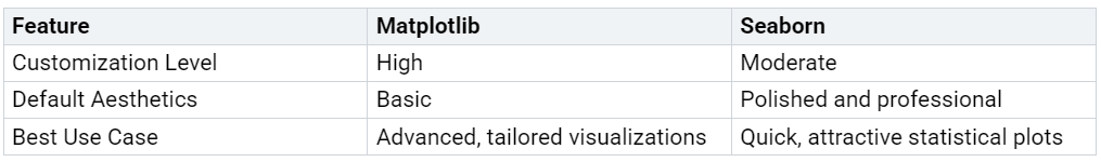
Matplotlib’s greatest strength lies in its versatility. You can customize nearly every aspect of your plots, from colors and labels to axes and gridlines. This level of control is invaluable when you need to tailor your graphs for presentations or publications. It also supports a wide range of file formats, allowing you to export your visualizations in the format that best suits your needs.
Professionals often rely on Matplotlib for financial plotting. Its ability to create detailed and precise visualizations helps investors and analysts make informed decisions. Additionally, its compatibility with other Python libraries, such as NumPy and SciPy, enhances its functionality for scientific computing.
Weaknesses of Matplotlib
Despite its strengths, Matplotlib can feel overwhelming for beginners. The extensive customization options, while powerful, often require a steep learning curve. Creating complex plots may involve writing a significant amount of code, which can be time-consuming. Furthermore, its default styles may appear outdated compared to more modern libraries, requiring additional effort to make the graphs visually appealing.
Seaborn: Simplifying Statistical Visualization
Key Features of Seaborn
Seaborn is a high-level Python library designed to make statistical visualization more accessible and visually appealing. Built on top of Matplotlib, it simplifies the process of creating complex plots. You can use Seaborn to generate a variety of graphs, such as scatter plots, line plots, and heatmaps. These options allow you to explore data relationships and trends effectively.
One of Seaborn’s standout features is its ability to integrate statistical functions directly into your plots. For example, you can add regression lines or confidence intervals to your graphs without additional coding. Seaborn also provides built-in themes that enhance the aesthetics of your visualizations. These themes ensure your plots look polished and professional with minimal effort.

Strengths of Seaborn
Seaborn excels in creating visually appealing and informative plots. Its aesthetic customization options let you adjust styles and color palettes to match your preferences. The library includes built-in themes, which you can apply easily to give your graphs a professional look. This makes Seaborn an excellent choice for presentations or reports.
You will also appreciate Seaborn’s versatility. It supports a wide range of plot types, from simple scatter plots to advanced heatmaps. This flexibility allows you to visualize data in ways that best suit your analysis. Additionally, Seaborn integrates robust statistical functions, enabling you to highlight trends and patterns directly on your plots. These features make it a powerful tool for statistical data exploration.
Weaknesses of Seaborn
While Seaborn simplifies many aspects of plotting, it has some limitations. Its reliance on Matplotlib means it inherits certain constraints, such as slower performance with very large datasets. Additionally, Seaborn’s customization options, though extensive, may not match the level of control offered by Matplotlib. If you need to fine-tune every detail of your graphs, you might find Seaborn less flexible.
Another drawback is its dependency on structured data formats like Pandas DataFrames. If your data is not already in this format, you may need to spend extra time preparing it for visualization. Despite these challenges, Seaborn remains a valuable tool for creating attractive and insightful statistical plots.
Matplotlib vs. Seaborn: A Detailed Comparison
Ease of Use and Learning Curve
When comparing matplotlib vs. seaborn, you’ll notice a significant difference in how easy they are to learn and use. Matplotlib, being the older library, offers a lot of flexibility but requires more effort to master. You need to write more code to achieve even basic visualizations. For example, creating a simple bar chart might involve several lines of code to define axes, labels, and colors. This can feel overwhelming if you’re just starting with Python.
Seaborn, on the other hand, simplifies the process. It provides high-level functions that let you create beautiful graphs with minimal code. For instance, generating a heatmap or a scatter plot with regression lines takes just one or two lines of code. This makes Seaborn an excellent choice for beginners or anyone who wants quick results without diving into complex syntax.
Tip: If you’re new to data visualization, start with Seaborn. Once you’re comfortable, you can explore Matplotlib for more advanced plotting needs.
Customization and Flexibility
Matplotlib shines when it comes to customization. You can control every aspect of your plots, from the size and color of markers to the positioning of labels and legends. This level of detail is ideal for creating publication-quality graphs or tailoring visualizations to specific requirements. For example, you can adjust the thickness of gridlines or add annotations to highlight key data points.
Seaborn, while powerful, doesn’t offer the same level of control. It focuses on providing aesthetically pleasing defaults, which work well for most use cases. However, if you need to fine-tune your plots beyond what Seaborn allows, you’ll often find yourself using Matplotlib commands. This is because Seaborn is built on top of Matplotlib, and it inherits much of its functionality.
Types of Visualizations Supported
Both libraries support a wide range of visualizations, but their strengths differ. Matplotlib is incredibly versatile. You can create everything from basic line charts to complex 3D plots. This makes it suitable for diverse applications, including scientific research, engineering, and financial analysis.
Seaborn specializes in statistical visualization. It excels at creating plots like heatmaps, pair plots, and violin plots, which help you explore relationships and distributions in your data. These types of graphs are particularly useful when working with structured datasets, such as those stored in Pandas DataFrames.
Note: While Seaborn simplifies statistical plotting, you can always combine it with Matplotlib to access a broader range of visualizations.
If you’re deciding between matplotlib vs seaborn, consider your project’s needs. For general-purpose plotting, Matplotlib is the better choice. For statistical analysis and quick, polished visuals, Seaborn is more effective.
Performance with Large Datasets
When working with large datasets, the performance of your visualization library becomes a critical factor. Both Matplotlib and Seaborn have their strengths, but their capabilities differ significantly when handling billions of data points.
Matplotlib offers robust performance for large-scale data visualization. Its low-level architecture allows you to optimize resource usage by customizing how data is processed and displayed. For instance, you can downsample data or use efficient rendering techniques to reduce memory consumption. This makes Matplotlib a reliable choice for creating detailed graphs from massive datasets. However, generating highly complex plots may still result in slower rendering times, especially if you are working with real-time data.
Seaborn, being built on top of Matplotlib, inherits some of its limitations. While it simplifies the process of creating polished statistical plots, it may struggle with very large datasets. Seaborn relies heavily on Pandas DataFrames, which can become a bottleneck when processing millions of rows. Additionally, its high-level functions, designed for ease of use, may not provide the same level of optimization as Matplotlib. This can lead to slower performance when visualizing extensive datasets.
Tip: If you need to visualize large datasets efficiently, consider combining Matplotlib with other high-performance libraries like Dask or Vaex. These tools can preprocess your data, allowing Matplotlib to focus on rendering the final visualization.
Modern high-performance libraries can handle billions of data points with minimal lag. They achieve this by using intelligent algorithms that reduce resource consumption. For example, some libraries support real-time data visualization with refresh rates of up to 100 times per second. While Matplotlib and Seaborn may not reach this level of performance on their own, you can optimize their usage by leveraging such techniques. This approach can save you significant time and energy during the plotting process.
In the Matplotlib vs. Seaborn debate, your choice depends on your specific needs. If you prioritize flexibility and are comfortable with optimization, Matplotlib is the better option for large datasets. On the other hand, if you value simplicity and are working with moderately sized data, Seaborn remains a strong contender. Both libraries can be used together to balance performance and ease of use, making them versatile tools in your Python visualization toolkit.
Choosing Between Matplotlib and Seaborn
Matplotlib and Seaborn each bring unique strengths to Python data visualization. Matplotlib gives you unmatched flexibility for creating advanced and highly customized graphs. Seaborn simplifies statistical plotting, making it easier to generate polished visuals with minimal effort. Instead of choosing one over the other, you can combine both libraries to maximize their capabilities. Experimenting with these tools will help you identify which one aligns best with your project needs and skill level. By mastering both, you can create visualizations that effectively communicate your data’s story.
FAQ
What is the main difference between Matplotlib and Seaborn?
Matplotlib provides extensive customization for advanced visualizations. Seaborn simplifies statistical plotting with attractive defaults. You’ll find Matplotlib better for detailed control, while Seaborn works well for quick, polished graphs. Both libraries complement each other and can be used together for versatile plotting.
Can beginners use Matplotlib effectively?
Yes, but it requires patience. Matplotlib has a steeper learning curve due to its detailed syntax. Start with simple plots and gradually explore its customization options. If you’re new to Python, Seaborn might be easier to learn first before diving into Matplotlib.
Is Seaborn faster than Matplotlib for large datasets?
No, Seaborn inherits Matplotlib’s limitations when handling large datasets. Its reliance on Pandas DataFrames can slow performance. For faster visualization, optimize your data processing or use Matplotlib with high-performance libraries like Dask or Vaex.
Can I use Matplotlib and Seaborn together?
Absolutely! Seaborn is built on top of Matplotlib, so you can combine them seamlessly. Use Seaborn for quick statistical plots and Matplotlib for advanced customization. This approach lets you leverage the strengths of both libraries in your visualizations.
Which library is better for statistical analysis?
Seaborn excels in statistical analysis. It offers built-in functions for regression lines, confidence intervals, and distribution plots. If your focus is on exploring data relationships, Seaborn is the better choice. For general-purpose plotting, Matplotlib remains more versatile.