


Late one night, as I stared at my screen, I couldn’t shake the nagging feeling that my forecasting model was sabotaged by something much deeper than my code. The fatigue of endless hours of tweaking parameters was overwhelming, yet I knew the glitch in my model wasn’t just a technical error; it was a data quality conspiracy actively undermining my efforts. Armed with newfound determination, I embarked on a mission to reveal the hidden flaws lurking within my dataset that were leading to costly errors.
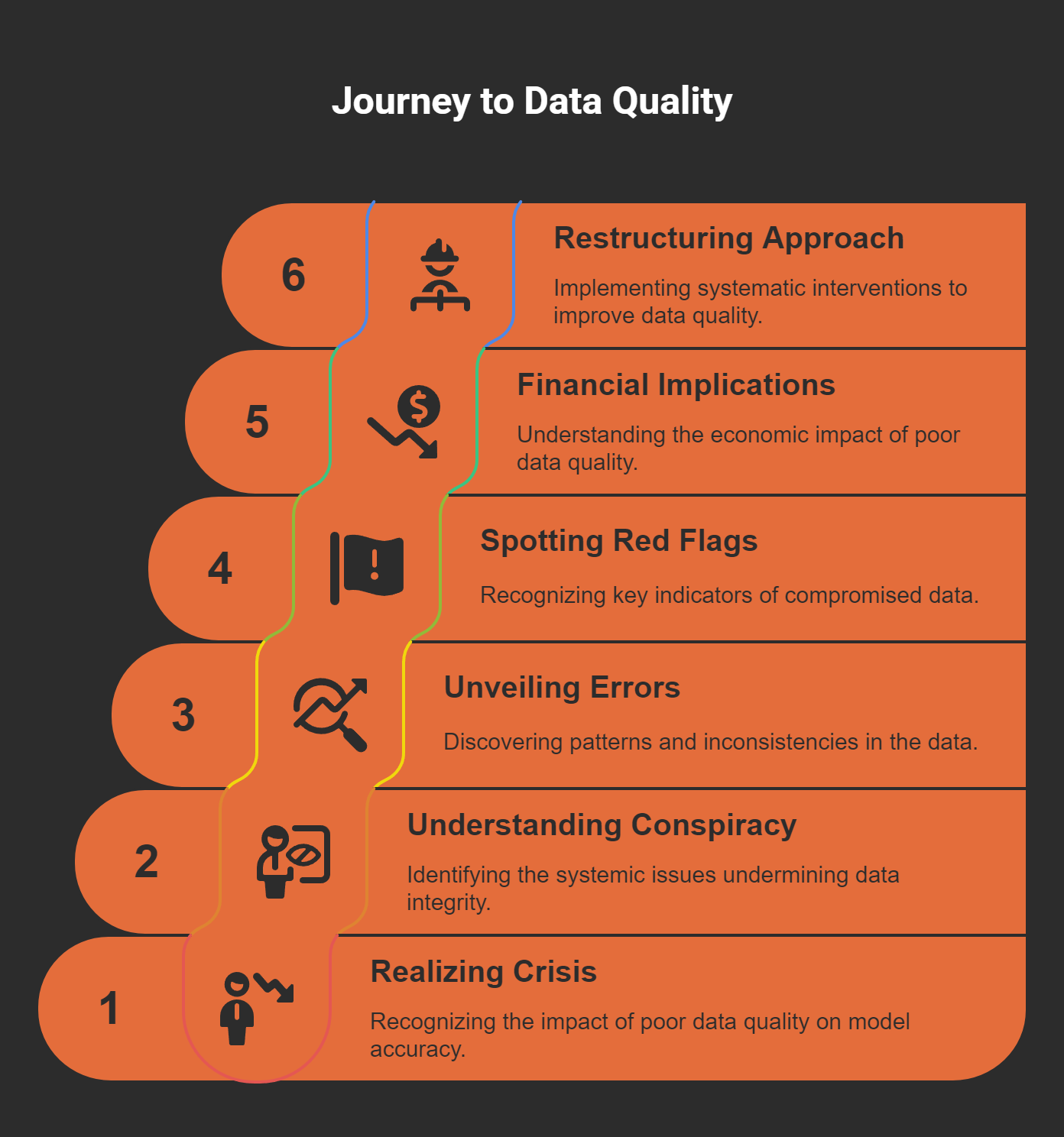
The Awakening: Realizing the Data Quality Crisis
As a data scientist, I have faced countless late-night struggles wrestling with models that just wouldn't yield accurate forecasts. I remember one particularly frustrating night, where I sat in front of my computer screen, staring at the results from my demand forecasting model for a retail client. My heart sank. The model had scored an impressive 87% accuracy during testing, but in production, it seemed to lose its way completely. I thought it was the algorithms. I thought it was my coding. But I was wrong. The heart of the issue, I would soon discover, lay deeper—within the very data we were using.
Understanding the Data Quality Conspiracy
Have you ever felt like you are fighting against an unseen enemy? That's how I felt with data quality. I call it the "data quality conspiracy." It's the idea that we often overlook the integrity of our data, focusing instead on the shiny allure of algorithms and code. But here's the kicker:
No model can overcome systematically corrupted inputs.
This became my mantra.
During that tumultuous period, it was vital to engage with my team and share what I was discovering. The reality is that data quality issues are often insidious. They lurk in the shadows, creating chaos without our knowledge. We can spend hours fine-tuning our models, but if we neglect the quality of the data feeding those models, we are setting ourselves up for failure. I was determined to shine a light on these hidden problems.
Unveiling Systematic Errors
As we delved into the data, the systematic errors started to surface. One of the key moments in our investigation came when we decided to visualize the data more closely. I created a series of graphs and charts, and lo and behold, there it was—a clear pattern of dips in website traffic every 72 hours. This was no coincidence; it was a systematic error that had gone unnoticed. It was alarming because we were basing our predictions on flawed datasets, leading our client to make decisions that would cost them dearly—over $230,000 in one quarter alone.
Can you imagine how it felt to realize that our oversight had such dramatic consequences? It was a wake-up call. I began to document these findings on what I humorously referred to as my “conspiracy board.” This board was filled with post-it notes, graphs, and arrows pointing to evidence of systemic failures. The findings were eye-opening. We uncovered timestamp inconsistencies, revealing that about 15% of our records were fundamentally flawed. It became clear that our data architecture had critical vulnerabilities, not due to malicious intent, but simple, everyday errors.
Spotting the Red Flags
As I dove deeper into the investigation, I started recognizing crucial indicators—what I now call red flags—that suggested compromised data. Three key types emerged:
Temporal Inconsistencies: Patterns like the 72-hour cycle we observed.
Distribution Drift: Subtle changes in statistical properties over time.
Relationship Inconsistencies: Shifting correlations between variables that were previously stable.
Understanding these flags was pivotal in refining our approach to data quality. Yet, it’s worth noting that traditional dashboards often failed to highlight these issues effectively. We needed better tools. In our search for solutions, we developed three visualization techniques that proved invaluable:
Heat maps for data completeness over time.
Distribution comparison plots.
Correlation matrices that illustrated relationships between variables.
These visual tools illuminated the anomalies hidden within our metrics, which had gone unexamined for too long. The deeper we looked, the more we realized how the human cognitive aspect contributed to our oversight. Biases, known and unknown, clouded our judgment. We were stuck in a cycle of confirmation bias, where we only saw what we wanted to see.
The Financial Implications
As we dug deeper, the financial ramifications of our oversight became staggering. Did you know that poor data quality costs the U.S. economy about $3.1 trillion each year? Organizations report an operating budget waste of around 15-20% due to corrupt data. This was not just a technical issue; it was a business continuity issue.
The implications were profound. I realized that we needed to implement systematic interventions throughout the data pipeline. We couldn't just check for quality at the initial collection and final analysis phases. We had to integrate automated validation checks at each step, ensuring that our data remained reliable at all times. This meant developing comprehensive visualization dashboards that provided immediate visibility into quality issues and establishing cross-functional quality reviews to foster shared responsibility across departments.
Restructuring Our Approach
After implementing these foundational pillars of data quality defense, we witnessed a remarkable transformation. We achieved a 94% reduction in production issues that required remediation and improved model accuracy by an average of 18%. But what became equally important was the structured methodology we devised to trace the data's journey from collection to analysis. It was enlightening to see how seemingly minor implementation flaws compounded into significant systematic errors.
My role evolved from being a mere data analyst to becoming an advocate for data quality within my organization. I started rephrasing our concerns about data quality in terms of financial impacts, aligning them with leadership's objectives. This was key to building a coalition of support across various departments. By fostering a culture that prioritized rigorous data integrity, we began making strides in improving our processes.
It’s imperative that we remain vigilant in continuously questioning our data sources and methodologies. Trust in our analytics ecosystem depends fundamentally on the integrity of our data. As data professionals, we must embrace a healthy skepticism and adhere to stringent quality checks. This journey has taught me that it’s probably not your code. It’s your data quality.
Conclusion
Reflecting on my journey through the data quality crisis, I realize that the challenges we faced were not just technical but deeply rooted in our organizational mindset. The more I delved into the data, the clearer it became that the landscape of analytics is littered with potential pitfalls caused by poor data quality. The late nights spent in front of my computer, the frustrations, and the eventual revelations all culminated in a pivotal understanding: to achieve reliable insights, we must scrutinize our data with the same rigor we apply to our algorithms.
As we move forward, I encourage everyone in the field to view data quality not as an afterthought but as an essential pillar of our work. Let’s challenge the norms, question the data, and strive for excellence in every aspect of our analytics journey. To truly succeed, we must ensure that our data is not just abundant but also reliable, accurate, and trustworthy.


